Are you publishing massive, data-heavy reports that nobody actually reads?
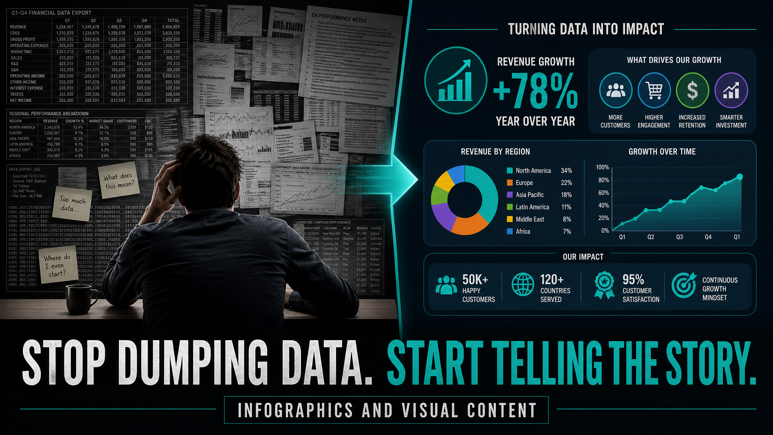
If you are dumping spreadsheets, complex statistics, and 40-page whitepapers onto your audience, you are putting them to sleep.
Human beings are not wired to process raw data. We are wired to process visual stories.
If you want your data to actually influence decisions, build authority, and get shared across the internet, you must stop using spreadsheets and start mastering Infographics and Visual Content.
The Trap of Data Dumping
Most businesses think that providing more data proves they are more authoritative.
They write a blog post with 15 different statistics about industry growth. They present it as a giant wall of text. The reader opens the page, feels instantly overwhelmed, and hits the back button.
Data without context is just noise.
Your audience does not want to do the hard work of analyzing your data to find the insight. They want you to hand them the insight on a silver platter. If you make them work for it, they will leave.
Visualize the Insight, Not Just the Numbers
Visual content is not about making data look pretty. It is about making data instantly understandable.
Here is the three-step framework to turn boring data into highly shareable visual content.
1. Find the Single “Aha!” Moment
An infographic should not try to tell 10 different stories. It should tell one story brilliantly.
Look at your data and find the single most surprising, counter-intuitive, or valuable insight. What is the “Aha!” moment?
If your data shows that 80% of businesses fail because of cash flow, not lack of sales, that is your story. Strip away everything else. Focus the entire visual on that one shocking truth.
2. Use the “Glance Test”
A great piece of visual content must pass the glance test. If someone looks at it for three seconds, do they understand the main point?
Use contrasting colors to highlight the most important number. Use simple icons instead of complex charts. Keep text to an absolute minimum.
If they have to read a paragraph of text to understand the chart, you have failed. The visual must do the heavy lifting.
3. Build for Shareability
The true power of infographics is their ability to generate backlinks and social shares.
People love sharing visuals that make them look smart to their own audience.
Make your infographic easy to embed on other websites. Chop it up into smaller, bite-sized “micro-graphics” for Instagram and LinkedIn. When you create a visual asset that perfectly explains a complex topic, other businesses will use it, share it, and link back to you as the source.
Viral Authority
When you master visual content, your data stops being boring and starts being a weapon.
You take complex, dry topics and turn them into highly engaging, easily digestible assets. You become the go-to source for industry insights because you are the only one making those insights easy to understand.
Imagine publishing an infographic that gets picked up by major industry publications because it perfectly illustrates a trend. Imagine watching your backlinks and SEO rankings skyrocket because everyone is citing your visual data.
That is the power of infographics. They turn complex data into undeniable authority.