“Quick Wins to Convert More Visitors in Under 30 Minutes”
A No-Fluff Guide to Spot & Fix the Most Common Website Mistakes
⚡ Why You Should Care
I’ve built thousands of websites since 1997 and I can honestly tell you that your website is often your first (and only) impression you’ll make with prospective customers. If it’s slow, confusing, or unclear… visitors bounce. Money walks.
This mini checklist focuses on high-impact fixes that don’t require a developer, tech background, or rebrand.
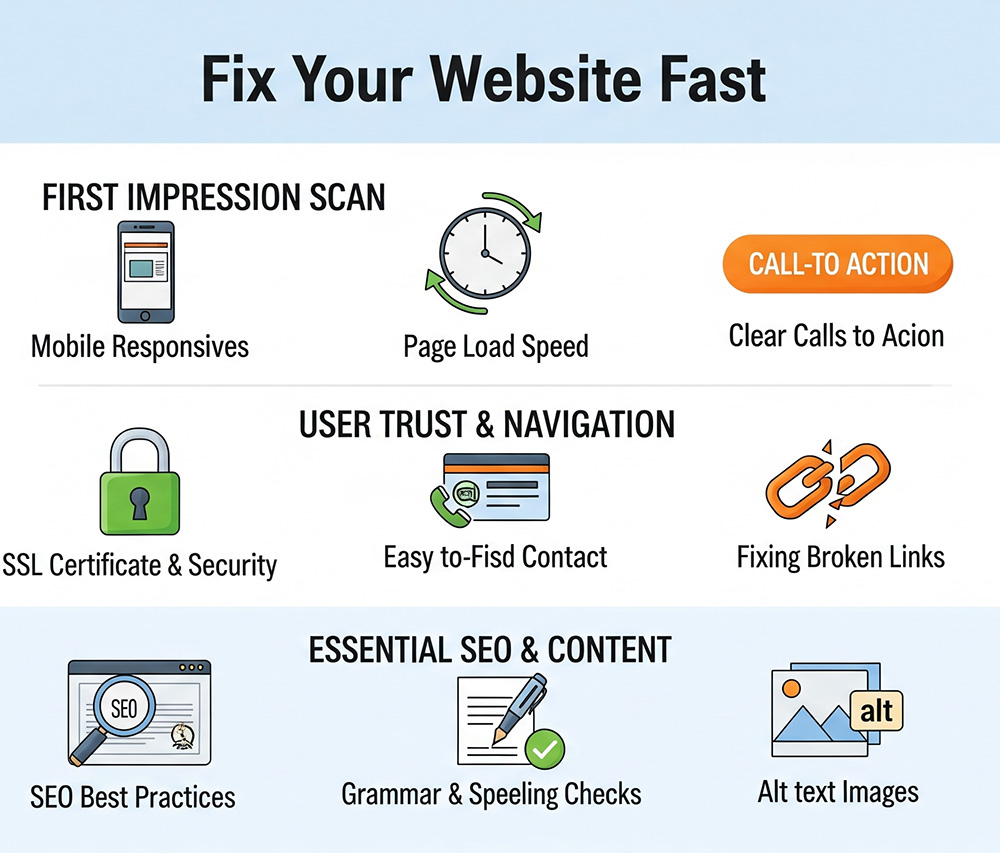
✅ MINI CHECKLIST (7 Key Fixes)
1. Clarity Check: What Do You Do?
❓ Can a first-time visitor understand what you do in 5 seconds or less?
☐ Your headline clearly states your product/service and who it’s for
☐ Your hero image or banner matches your offer
☐ No jargon, vague slogans, or corporate fluff (“We help you thrive”)
Fix: Rewrite your headline using this formula:
I help [ideal customer] [achieve result] with [your solution].
2. Call-to-Action: Is It Obvious?
❓ What’s the one thing you want visitors to do next?
☐ You have one primary CTA (e.g., Book a Call, Get a Quote, Buy Now)
☐ Your CTA is above the fold (no scrolling required to see it)
☐ Buttons stand out visually (color, size, spacing)
Fix: Change all passive CTAs (“Learn More”) to action-oriented phrases:
“Get Your Free Estimate” • “Download the Checklist” • “Book My Spot”
3. Speed & Mobile Check
❓ Does your site load fast and work on phones?
☐ Loads in under 3 seconds on desktop AND mobile
☐ Easy to read and navigate on a smartphone
☐ No weird formatting or off-screen elements
Fix: Test your site at https://pagespeed.web.dev
Compress images with TinyPNG.com or Squoosh.app
4. Trust Builders: Are You Credible?
❓ Would you trust your own site if you were a stranger?
☐ You have at least 1–3 testimonials or reviews
☐ Trust symbols are visible (certifications, logos, partners, media, etc.)
☐ You show your face or team (especially for personal brands or service-based businesses)
Fix: Add a testimonials slider, About section photo, or short bio near your CTA.
5. Offer Clarity: What’s in it for them?
❓ Do you explain benefits or just features?
☐ You highlight clear outcomes (“Save time,” “Get more clients,” etc.)
☐ You avoid buzzwords and industry speak
☐ You answer: Why now? Why you?
Fix: Add a bullet list with this header:
“Here’s what you’ll get…” or “Why clients love this”
6. Navigation Check: Is it intuitive?
❓ Can users find what they need quickly?
☐ No more than 5–7 items in the top navigation bar
☐ Home, About, Services, Contact, Blog (if applicable)
☐ No broken links or confusing drop-downs
Fix: Cut anything that’s not essential. Link your main offer or contact page clearly in top nav.
7. Lead Capture: Are You Building a List?
❓ What happens to visitors who aren’t ready to buy yet?
☐ You have a lead magnet or freebie to collect emails
☐ Opt-in form is easy to find (sidebar, popup, or embedded)
☐ Email goes into an automated welcome sequence (even just 1–2 emails)
Fix: Add a free checklist, quiz, or mini-guide to your homepage and sidebar.
✨ Summary: Quick Fix Scoring
| Section | Score |
|---|---|
| Clear Headline & CTA | ____ / 2 |
| Mobile Speed & Usability | ____ / 2 |
| Trust Elements | ____ / 2 |
| Offer Benefits | ____ / 2 |
| Navigation Simplicity | ____ / 2 |
| Lead Capture | ____ / 2 |
| Total | ____ / 12 |
🎯 10–12 = Great! Polish & keep optimizing
⚠️ 6–9 = Fix the weak spots ASAP
❌ 0–5 = Don’t panic. Just start at the top and work downDon’t have a website yet? Build your own at EasyNameHost.com. If you need a web designer instead, go to TheDigitalMarketingSolution.com